The client
The reference client for this project is Findomestic, part of BNP Paribas, one of the leading European banks in the banking and finance sector, with a strong global presence. Their app, with over 1 million downloads and a rating of 4.1 out of 5, ranks 16th in the Finance section on the App Store.
As part of this project, I quickly designed, tested and validated the new ‘Post Sale Tracking’ and ‘Document Archive’ features. In just 4 weeks, I designed and conducted remote usability tests on selected users to ensure an optimal experience.
UX Strategy
Before starting the product design process, I carried out a brief analysis to better understand the strategy to be used to meet the customer's requirements during the kick-off call.
The problem in achieving our objective was precisely the short time available for the testing and validation part, so the methodology we decided to use for the UTs had the following requirements:
Short timeframe: do usability testing in a short time and gain insight quickly
Remote testing without a mediator: Test remotely without the presence of a mediator during the performance of the tasks, to let the participants remotely complete the tasks in their natural environment using their own devices.
Testing at low cost
This generated an opportunity, to use Maze software to conduct remote unmediated UTs.
Product Design
During the actual production and design phase of the features, I started with the creation of a general benchmark in order to actually understand what choices other players had made in the design phase, and to identify potential useful patterns by also observing industries other than fintech.
The concepts served to validate the flow at a high level together with the client, effectively understanding the components we needed and what information to include in the screens.
Lastly, the final UI was realised on a reduced device size (360px) so as to make it potentially scalable to all mobile devices.
Remote Usability Test with Maze
To realise the structure of the usability tests, I started by understanding together with the client what we actually wanted to test of the two new features, and then went on to define how we could get that response and what specifically would be the ideal task to get there.
The testing sessions involved 21 people, lasted about 7 minutes and were structured in 3 parts:
Background questions: questions related to the habits and preferences of the people interviewed, useful for understanding the motivations for their behaviour with the product;
6 missions: the tasks that were given to the interviewees who were asked to interact with the prototype;
Closed and open questions: asked both at the end of each task and at the end of the testing session, useful to understand the opinions of the interviewees with respect to what they had just seen
Findings and Suggestions
In general, out of 6 tasks only 3 generated interesting insights related to the test results. Mainly changes related to: font size, page architecture, component anatomy were proposed. Going into more detail, let us see some of the most interesting results of some of the tasks:
Task 3 - Digital copy of contract
‘You have requested a digital copy of your Deposit Account activation contract. Download the digital copy of the contract.’

The result highlights the high cognitive load on the homepage, which caused 11 abandonments. Many users confused the Current Account with the Deposit Account and once they landed on the Accounts and Cards page, instead of swiping, they abandoned (precisely 6).
Within route A there were 6 drop-outs once they landed on ‘Accounts and Cards’. This figure suggests that the swipe between cards can probably be improved. One possible cause could be the low contrast ratio between the product card and the background.

Emerging findings
Insert the carousel in the Accounts and Cards page directly in the header to make the card stand out more from the background.
Work on pagination, lengthening the dot marking the card displayed in viewport.
Decrease the general width of the cards to give more space for swiping.

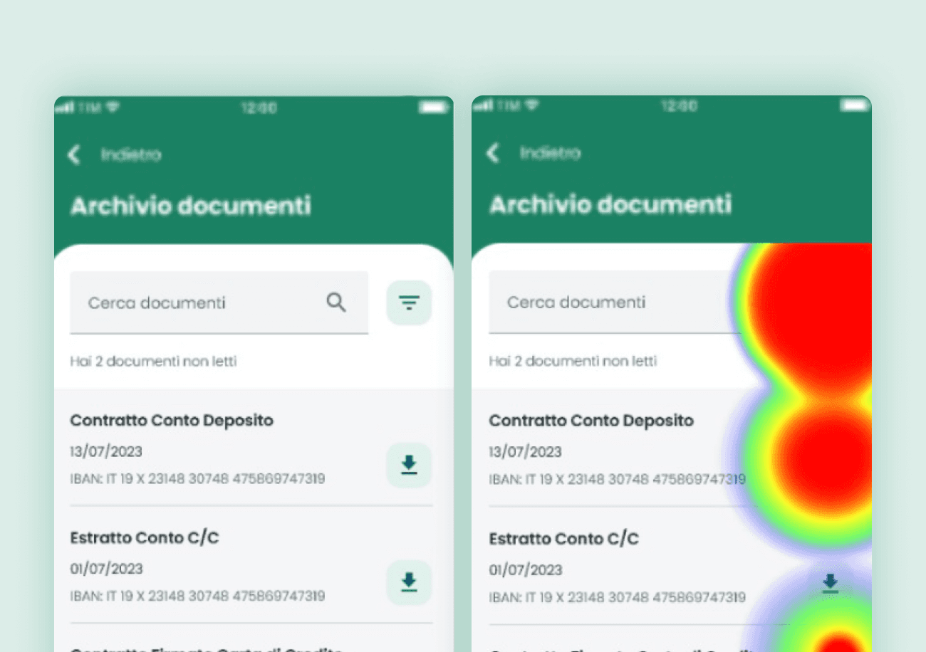
Task 6 - Download unread documents
‘While you are checking your document archive, you notice that some have not yet been consulted. Download the documents you haven't read yet.’

In general, looking at the heatmap, it can be seen that the general actions were understood by the users. The distinction between the two reading states caused some difficulties, which also generated conflicting opinions on the entire task.

Emerging finding
By inserting a microdot to the left of the primary label and working on the weight of the latter, making it change from semibold to regular when the document is unloaded, a greater visual separation between the two states is achieved.

Some slides of the presentation 🤓
Results and impact on the project
At the end of the activity, a presentation was made as the final output of the project, explaining the results of each task in detail. A total of 4 total insights from the realised analysis were introduced into the UI in production:
Credit Card Reissue (Task 1)
Findings 1: Banner in the ribbon / Findings 3: Primary product labels changed from 14px to 16px.
Digital copy of the contract (Task 3)
Findings 2: Lengthen active pagination to make the component more prominent.
Digital copy of contract (Task 6)
Findings 1: New proposed reading status with microdot and intervention on label weight
Want to stay in touch?
Let's catch up for full-time job opportunities, a chat about design, or simply for a greeting 👋🏻


