The client
Sara Assicurazioni is an Italian insurance company and corporate group. Founded in 1946 as Società Assicuratrice Rischi Automobilistici, it is the official insurer of the Automobile Club d'Italia. It is headquartered in Rome and, in addition to the third party motor liability line of business, it also operates in the Elementary Branches (home, accident, health), Life Insurance and Pension and Fund Management.
Were we started from
Insurance apps often have a rather limited frequency of use. We have not stopped at engaging customers only in premium or claim situations, but aim to build an ongoing connection. We aim to create an ongoing relationship that not only promotes retention, but also opens up opportunities for upselling.
The customer mainly asked us to revise the structure of the services page, thus touching the entire app architecture, maintaining the Service vs. Product oriented paradigm.
App Analysis As-Is
This type of analysis served to ascertain the state of the architecture and the amount and type of information on the pages. So as to begin to understand the logic behind the first design phase and the problems.
The main problem was that the Home Page had become a binder of Promo, Services, Lead and Engagement, making it not very usable by users, who were faced with an extremely dense cognitive load.
The services page actually contained information about goods, making it misleading and of little use to users looking for Sara's services.
Prioritisation and frequency of use of features
For the prioritisation of the features, the Kano model was used, which is based on a two-dimensional grid: the horizontal axis represents the investment made by the organisation; the vertical axis represents user satisfaction.

Using features via Red Routes
In red routes are the activities that offer the most value to users. Some advantages of identifying red routes:
Prioritises user needs
Avoids scope shifting and the introduction of extraneous/accessory functions
Helps create and optimise product features that deliver the most value and drive key metrics.
This analysis showed that the document section, active assets and policies and stamp expiry were among the most used features within the app.
Benchmark on Home, Services and Loyalty
In this phase, the aim was to identify recurring patterns, gains and pain points of other players and to find interesting findings to report in the App.
Card Sorting
It turned out that the distribution of features within the app is not optimal: there are more relevant features that are too hidden and less relevant features that are too prominent. Some are repeated too often in the different pages and sections; others are simply not where the user expects to find them. By means of a remotely realised workshop, the features to be subsequently brought into the UI were defined:
2 product owner Sara (Giovanni e Amir)
2 Sara's developers (Alessandro e Marco)
4 designer of Enhancers (Gab, Thomas, Vale, Andre)
4 designer of Accenture (Martina, Valeria, Andrea, Giorgia)
1 designer of Enhancers from outside the project
1/2 external persons who might use the app (Catanzariti)
1 person from outside the project from Sara
Open card sorting
In which features are categorised independently by type, so that all possible clusters emerge. It would also be necessary to differentiate generic services from policy-related services. Finally, the problem of naming categories (e.g. transactions/actions) could be solved.

Close card sorting 1
In which features are placed in the as-is sections in order to give them the most functional placement. The results were very similar to those that emerged from the Open Card Sorting, thus validating what emerged in the first step. Three features in particular emerged as unnecessary:
Listen ACI Radio
Find home
View my position

Close card sorting 2
In which features are placed in possible future sections, so as to act as an activator for label-related reasoning and understanding the most functional placement of features.
User Interface
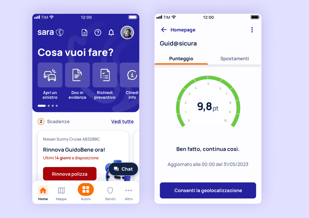
Within the Home Page, the architecture has been completely overhauled, also implementing some adjustments to the components such as the quick actions, which have been shrunk to take up less space.
The logic of the news section has been completely redesigned, following a more story-like approach, which is much more engaging for the user.

The architecture of the Services page has been radically changed, effectively giving more space to the services offered by Sara, also visually reducing the component. The individual assets have instead been moved to the Home Page, while the promos have moved to the Services page, where all the policies that can be activated are present.

Want to stay in touch?
Let's catch up for full-time job opportunities, a chat about design, or simply for a greeting 👋🏻


